Testing the VINCE app in Norrköping
In the end of May 2024, VINCE reached a significant milestone, when the first testing workshop was held during a partner visit to Norrköping, Sweden. During the first day of the visit, the project team analyzed the progress of the project so far and held a workshop on the theme “The voices of the target group – how do we learn from them”, under supervision of Sateenkaari Koto’s project coordinator.
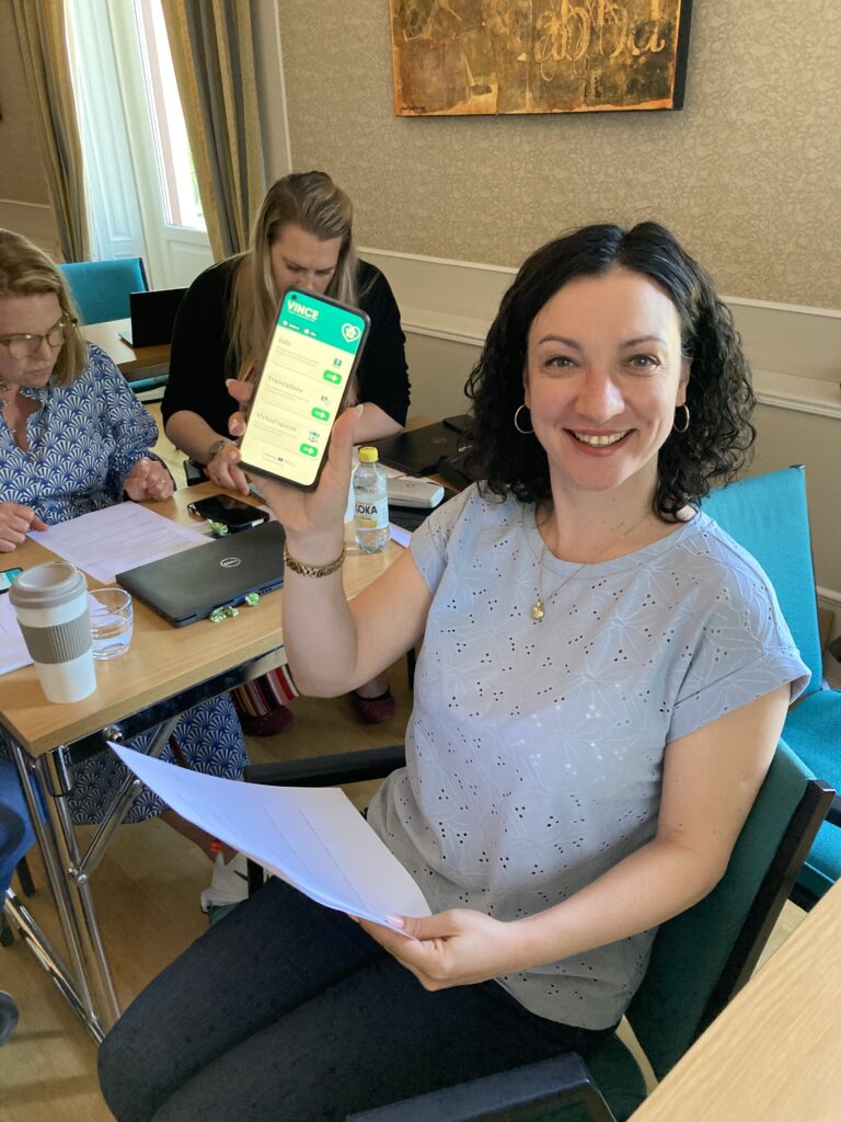
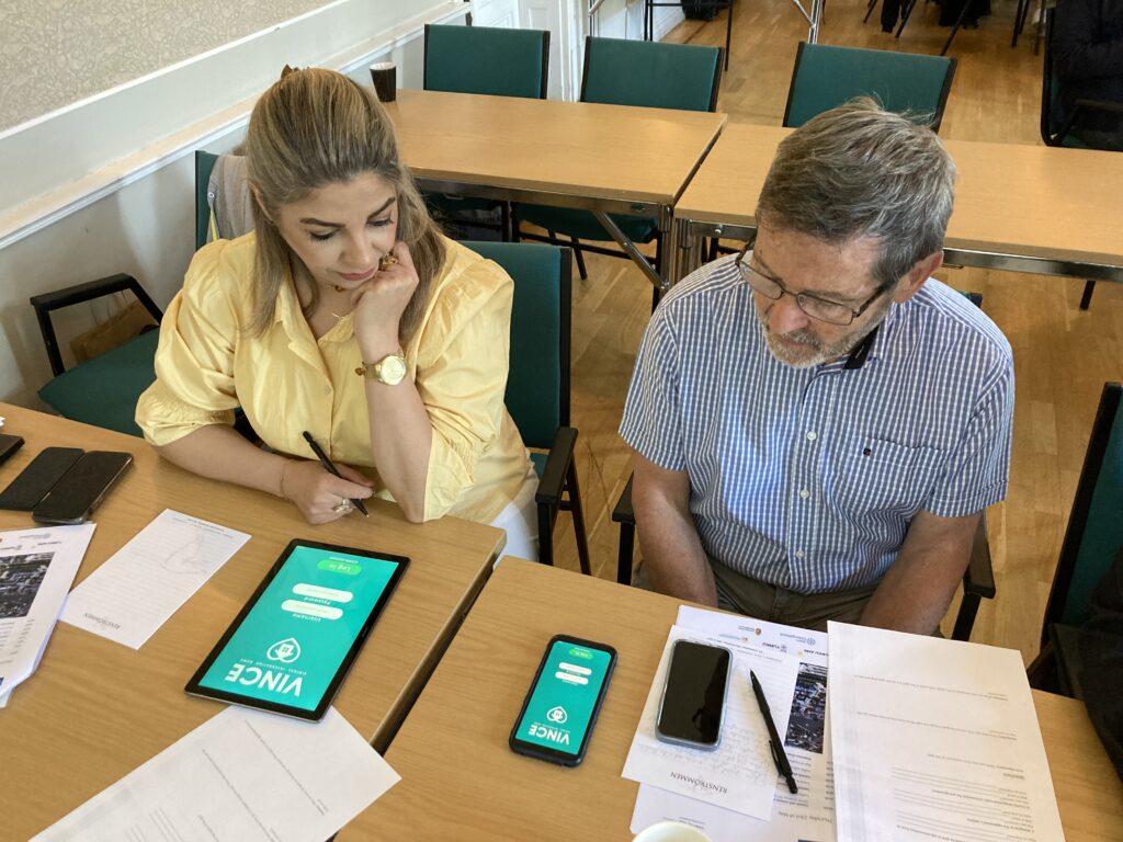
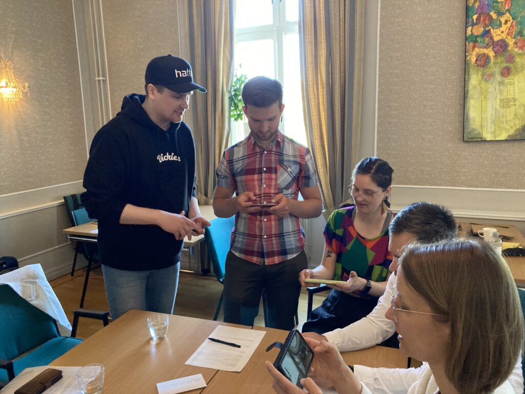
The testing of the app took place on the second day of the partner visit. The primary goal of the testing was to gather honest feedback and ensuring that we are moving in the right direction. More specifically, we wanted to evaluate the usability and functionality of the VINCE mobile application.
A big thanks to Refugee Health Centre, and the County Administrative Board of Östergötland for facilitating the partner visit and the testing!

Here’s how we did it:
Who tested the app?
We had around 20 participants from our project partners, migrant counselors, and people who work closely with our end-users.
What did we test?
Testing itself was divided into two parts.
The first part was about the app’s user interface and how easy it is to navigate. We gave the participants specific tasks, like finding a chat function to talk to AI, exploring the application’s options, and locating different topics, like info for entrepreneurs.
The second part of our testing looked at the application’s virtual spaces. Similarly, we gave the participants a couple of tasks to do, like move around, interact with objects, and leave and come back to the space.
Alongside these tasks, we also asked open-ended questions about their initial impressions, thoughts on design, accessibility, engagement, and comfort level.
Why did we do it?
By arranging the testing like this, we wanted to see how people interacted with the app in real-world situations. By observing how they navigated through the user interface and explored the virtual space, we gained insights into what’s working well and where improvements are needed.

Feedback summarized
The results emphasized the importance of user feedback in refining the application. Most of the participants were pleased with the visual outlook of the app. The participants provided practical suggestions for boosting the application’s usability. The need for more guidance and visual indicators was a reoccurring theme. For the user interface this means icons and clear and descriptive titles. And for the virtual spaces, a different approach to the movement, a tutorial and visual indicators are needed. Additionally, participants highlighted the necessity of simplifying information presentation by reducing text, incorporating collapsible sections where possible, and using more visual elements and icons.
Next steps
With this valuable feedback, we, the development team, are set to continue the work. Our next steps involve implementing changes and improvements that address user needs. By continuously refining the app based on user input, we aim to create a robust and user-friendly platform that facilitates virtual counseling and integration support for migrants.


